home | north bay bohemian index | music & nightlife | essay

Freaky girlfriend: What is Norah Jones really saying?
Cover Story
Life's lessons found in a surface-only shopping spree
By Sara Bir
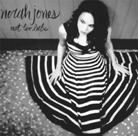
The new Norah Jones album is great. I have no idea what it sounds like, but the cover is terrific. There she is, her dark hair falling softly over her bare shoulders, sitting daintily on the floor with the skirt of her fetching red and black dress radiating out from her waist, looking sophisticated and flirty and harmless all at once. She looks like everyone's dream girlfriend. With all of those pretty jewel tones and patterns, it's a world you want to crawl into.
Blue Note, Jones' label, hopes you feel the same way about Not Too Late. Usually people don't buy albums just for their covers, but it happens. I know, because I'm one of those people.
You can argue that album art does not matter as much as it used to, what with music downloads and all. Though there's a small degree of truth in this, it's a silly assumption. People still care about how things look, and every boring album cover is a squandered marketing opportunity. A good cover paints a picture, hinting at the music it packages. It's a risky maneuver, because if the whole record is spelled out for you on the cover, why bother with what's inside?
Norah got me wondering what elements make one cover stand apart from its fellow Johnny-come-latelys on the "New Releases" rack. So I went to that palace of commerce known as the Virgin Megastore to take in an eyeful of new CDs, pretending I knew nothing about any band in the universe. Here are the covers I liked best.

Mika, 'Life in Cartoon Motion' Looks like a Technicolor notebook doodle come to life. Is there candy in this album? Does it come with a matching T-shirt?

'The Good, the Bad & the Queen' An awful name for a band, though maybe a good name for a book. And this looks more like the cover of a novel of Dickensian misery than a CD.
I like books.

'Katherine McPhee' Is this an album or a Bebe ad? Good thing Katherine is pulling the hem of her sweater-dress over her crotch, because otherwise this would be vulgar.

Caetano Veloso, 'Ce' Simplicity at its boldest. Nothing here but a striking plane of bright purplish blue with a magenta "cê" in the corner. Joyfully monochromatic.

'The Bird and the Bee' A charming painting of little girls in orange outfits with butterfly nets in a green valley under a cyan sky. It could be from the sort of picture book you read to kids when you want them to take a nap. Yes, this album looks like a nice nap.

Stone's Throw, '10 Years Words' Lots of words against a black background. An abundance of words on a cover can overwhelm, but these blocky, retro-tastic letters are placed in an almost abstract manner, like avant garde 1970s wallpaper.
A good album cover (or a good-bad one, for that matter) snags our attention because it comforts us or disturbs us or delights us. It wants to be stared at. It should look the way the music sounds. People love to rip on bad album covers, perhaps more than they love to celebrate classic ones; it's fun and effortless. But the sad truth is that the vast majority of album covers are merely mediocre and completely forgettable: there's a pinup photo of the artist emblazoned with title information in the trendy font of the day, a formula used for decades.
In an interview with The Onion's AV Club last month, Glenn Danzig recalled his long-ago discovery of Black Sabbath. "I remember going into Sam Goody and looking in at the new arrivals. They had a jillion copies of this and a jillion copies of that, and they had one copy of Black Sabbath. Nobody knew who it was. I'm flipping through the vinyl, and all of a sudden I see this thing. It says 'Black Sabbath,' and there's this girl in a witch's cloak, and she's in this burned-out fucking electric forest or whatever. I didn't know what it sounded like. They didn't have listening stations back then. I just thought, 'This has to be good.'"

See, the Danzig method of album-purchasing can work to life-altering effect. Too bad people don't browse in record stores the way they used to, although it turns out half of the records that caught my eye at the Virgin Megastore are duds. At least I could line them up, their covers facing out and enjoy them for their looks.
Join the discussion on bad album art at www.zonicweb.net/badalbmcvrs.
Send a letter to the editor about this story.
|
|
|
|
|
|