home | metro silicon valley index | the arts | visual arts | review

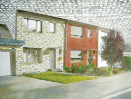
Facade: Stefan Kürten's oil 'Clouds' offers a tricky welcome at SJICA.
Place Markers
SJICA opens its finished gallery space with 'Home Sweet Home' show
By Michael S. Gant
NOW THAT it is comfortably ensconced in its permanent new space, the San Jose Institute of Contemporary Art understandably feels attuned to issues of place. Those primal instincts get full play from 14 invited artists in the gallery's inaugural show: Home Sweet Home. Several of the contributors tap into the natural nostalgia that clings like the scent of a home-cooked meal to one's memory of habitat. Catherine Wagner's nine gelatin silver prints capture the essence of three different homes in crisp black-and-white images of homey objects. A refrigerator shows the typical contents—a milk carton front and center—that fuel a family. A plain shelf holds collapsing, tape-strapped cardboard boxes labeled, in marker-pen scrawl, "Memorabilia."
In Constructed Memory, Jim Campbell re-creates the troubling time when his childhood home burned down. A translucent photograph of a simple clapboard home is illuminated from behind by a grid of miniature LEDs that produce a rippling flamelike pattern. Ghostly images of cars in the driveway and a kid's bike add to a sense of fleeting presence balanced with unobtainable absence, as in a dream. Stefan Kürten's large oil Clouds depicts an attached row of brick-front houses. A closer look reveals that these beckoning dwellings are actually a facade, a quickie movie-set memory of home.
Mark Bennett is nostalgic for other people's homes—TV families', which are perhaps more indelible than our own. Home of Ward and June Cleaver is an architect's floor plan of the famous '50s redoubt. This funny gag that goes no further than the Oedipal thrill of seeing how close Ward and June's bedroom is to the Beave's, but the companion piece, The Town of Mayberry, a blue-ink city plan for Andy Taylor's stomping grounds, contains a fanatical wealth of minutiae, including the names of every building (Floyd's Barbershop), home (Nurse Peggy's house) and meadow. I doubt if even the show's creator's knew this much about Mayberry. Going very far afield, Richard Barnes' large color print shows a delicate bird's nest in which the usual twigs and straw are interwoven with a wreath of full dark-red maple leaves. The nest is empty but pregnant with possibilities—the missing purple finches that built it are the Frank Lloyd Wrights of the avian set.
Several of the artists evince an almost obsessive approach to the show's theme. Jim Christensen's ideal home (under construction) consists of three large models of his childhood residences in the open-frame stage of construction stacked atop each other. The precision assembly of Christensen's miniature wood studs and rafters is overwhelming; you can almost imagine that it was the work of a swarm of literal carpenter ants. In a conceptual process mode, Stephen Sollins sets himself a task and dutifully carries it out—unraveling an old-fashioned embroidery sampler, counting the stitches for each color, then restitching the whole thing as an overlay of colored squares; the sizes of the boxes function as a kind of graph of the color choices made in the original. I found myself admiring the effort, but wondering if the minimal result (there are three examples) was worth the time and effort. The information revealed by the deconstruction of these sentimental homilies reduces rather than enhance the originals.
In a room by itself, Oliver Michaels' entertaining 14-minute DVD loop Train creates a vast imaginary architecture of connected spaces. Laying down modular track and mounting a small camera mounted on the front end of a toy train, Michaels records a vast floor-level journey. Transitions from room to room take place when the train plunges through a tunnel mouth (about the size of a cartoon mouse hole in a baseboard), and an invisible edit allows it to exit in a different room. This train takes us on a witty trek through rooms both tidy and cluttered, through crawl spaces and underneath a glass-top conference table; even through a bathroom (where the locomotive stops for a second in awe of the porcelain throne before accelerating pass). The train perseveres across various brands of shag carpet, even making a detour through an outside garden where we see a fleeting glimpse of a hand—the only human presence in this cluttered but seemingly abandoned world. The swoops and sudden turns as the train negotiates the track curves imparts a dizzying sense of motion, like being on Mr. Toad's Wild Ride at Disneyland. Michaels has found a way to show us the most familiar homescape in a wildly different and exhilarating way.
Home Sweet Home runs through July 21 at the San Jose Institute of Contemporary Art, 560 S. First St., San Jose. The gallery is open Tuesday–Friday 10am–5pm, Thursday 10am–8pm, Saturday noon–5pm. (408.283.8155)
Send a letter to the editor about this story.
|
|
|
|
|
|