![[Metroactive CyberScape]](/cyber/gifs/cyber468.gif)
[ CyberScape | Metro | Metroactive Central | Archives ]
The Cuddletech Revolution
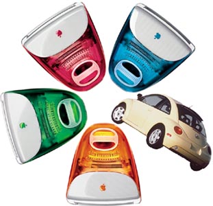 Curves Ahead: The iMac, a multi-colored study in the power of cuddletech; and the new Beetle, technologically a Golf, but emotionally few cars can hold a candle to it. As machines become more indispensible parts of our lives, they are becoming like us ... diverse, colorful and anything but square. Our relationship with technology is changing. Everything from the cars we drive to the brushes we use to scrub dishes has to make us feel good, has to look good. It has to say something too. By Michael Learmonth BEIGE BOXES never had it so bad. At the MacWorld Expo, Apple interim CEO Steve Jobs made relics of them like no one ever had before. In a presentation that was part P.T. Barnum and part David Copperfield, Jobs unveiled the latest Mac in a spectrum of colors that looked good enough to eat. And the usually critical crowd, full of grizzled computing veterans and jaded industry journalists, temporarily lost their cool and reacted with an impulsive, unconscious glee. Upon the Moscone Center stage in San Francisco sat the iMac, not just in its original translucent, bondi blue iteration, but in blueberry, strawberry, grape and lime. For an instant, before the cynics could focus on the limitations of the new product, the lack of a new laptop or the absence of any truly revolutionary technology, the crowd indulged a raw emotion that emanated from their collective solar plexus. As they lined up to take a peck at the row of machines with fine plumage, their lips formed circles as they whispered the prevailing sentiment: "Wow." "We hope you will want to collect all of them," deadpanned the ever-glib Jobs, sporting his faded denim "Think Different" approach to business attire. The crowd tittered, but even Jobs knew his comment wasn't really that far-fetched. For while his iMac sales projections don't yet reflect any serious collecting, he knows he has tapped that part of the human brain that can form strong emotional attachments to cold, inanimate objects. Even though there will always be people who speak in megahertz and gigabytes, the majority of future computer buyers will look to their computers for something that reflects a little bit of what it means to be human. The idea seems visionary and ridiculous at the same time. But as the stock price soars and another iMac sells every 15 seconds, it's becoming clear: Steve Jobs knew computer consumers would want pretty colors before even the consumers themselves did. "From the Mac standpoint, all he did was add color," explains Tim Bajarin, president of Creative Strategies in Campbell and a veteran Apple-watcher who should have seen all the tricks before. "Steve Jobs actually believes his first legacy was creating the first PC for the 20th century and his next is creating the PC for the 21st." To be fair, other computer manufacturers--the stolid Hewlett-Packards, the Dells, the Compaqs--left this niche wide open with a decades-long addiction to unobtrusive, bland colors and boxy shapes. Hartmut Esslinger, designer of the original Mac and an innovator in computer design, says almost any design is an improvement over the prevailing "endless list of awful computers."
IT TURNS OUT that Apple's colorful coup is not an isolated phenomenon. The very next week, in another industry in a frozen town far, far away, candy colors and anthropomorphic shapes were making another cameo appearance--and making another businessman very rich. In Chicago, at the International Housewares Show--one of the largest such trinketfests in the nation--importer Elliot Zivin was performing his own circus act. He stood in front of a 9-foot illuminated pyramid that was luring people away from the steely Mixmasters, KitchenAides and Frigidaires, like a Teletubbie display at a toddler convention. On each of the white lighted steps of the pyramid sat kitchen tools, unlike any most people had seen before. There was a pot scrubber that stood up on little feet, a lemon juicer forming the head of a little alien figure, a spaghetti scoop wearing hints of eyes, nose and mouth. Each tool was sculpted in orange, blue, yellow--bright, playful colors taken from a pack of Starburst or a handful of Jolly Ranchers. "Everyone walks up and starts to smile," Zivin said, between answering constant gawker queries. "They're kitchen appliances with magnetism. You look at this stuff and start grinning." Zivin imports these little works of art from a German concern named Koziol, whose brilliant staff of forward-thinking designers has made something emotionally appealing out of the most mundane kitchen-sink technology. So cute, these kitchen doodads, that as soon as the anthropomorphic Koziol pot scrubber caught my eye, standing tall among its brethren, I wanted to hold it in my hand. So I bought it. As I walked away I felt the beginnings of a consumer hangover as my inner voice said, "Dude, you just spent seven bucks on a pot scrubber." I didn't care. I liked this pot scrubber and I had never liked a pot scrubber in my life. I wanted to see it standing next to my sink, even though, technically speaking, I know a scrubber with a soap-filled handle would put it to shame.
EVEN THE LEAST aesthetically astute CEOs in manufacturing are realizing a small revolution is taking place. The era of cuddletech is here. Gone are the hard edges--the subversion of design to pure function. And as computers get faster, appliances get better, the very tools of our age become cheaper and more ubiquitous, the manufacturers that master the principles of cuddletech will thrive. "Signs of cuddletech have been popping up for the last several years," noted writer Alisa Gordaneer in Detroit's Metro Times, "it's clear that some small revolution in industrial design has mandated that consumer goods should be--not just functional, not just fun--but irresistibly adorable." Once, in the development of new products, designers were called in at the last minute to wrap plastic around a machine or put a button where the engineer put a switch. Now, as those machines take their rightful place as appliances in the background of our lives, the design of the product, that product's ability to reflect our values or remind us of a positive feeling or experience, will place it above the others. In a world where products increasingly do the same things for the same price, the products designed outside-the-box will be the ones that fly off the shelves. Volkswagen showrooms were pretty lonely places until last spring. With billboards captioned "Hug it? Drive it? Hug it? Drive it?" the new Beetle brought gawkers and buyers alike into the showroom, generating interest not just in the Beetle, but also in the tired Jetta and Golf lines. More than 55,000 new Beetles were sold in 1998. As it turns out, Volkswagen wasn't planning to become the automotive beanie baby of the '90s. Designers first stumbled onto the power of cuddletech when they unveiled a battery-powered prototype of the new Beetle at the Detroit auto show in 1994. David Cole, now director of the industrial design department at the Academy of Art College in San Francisco, was on the prototype design team. "It was intended as a one-off to get people excited about VW products," he says. "There were no plans to produce the car." Then came the response, the unbridled fawning of the media and the public that caused VW to change its mind. "What we had to do then is take [the prototype] and make it work," Cole says. To hasten the process and keep it inexpensive, VW opted to poach a chassis from the existing Golf line. "Doing a show car is easy," Cole says. "The real work begins when you have to produce it." When they stretched the design to fit the larger Golf platform, Cole says, some of the prototype's magic was lost. "It got bigger and heavier looking," he says. A flaw perhaps only a designer would notice. Few consumers seemed to care. Three years after the unveiling of the new Beetle show car, nostalgic, even cuddly, designs populate the auto shows. This year Ford unveiled a new Thunderbird that looks like the 1957 coupe. Chrysler released the PT Cruiser built to evoke the comforting, misty memories of '40s-era cars. The success of the new Beetle is at the very heart of what cuddletech is all about. Technologically, the new Beetle is an old Golf with less rear headroom and cargo space. Emotionally, the Golf--and few other cars--can hold a candle to it. About 150 million to 160 million people have driven a Beetle. What Volkswagen has done is given them back a little bit of their college years or some other nostalgic time without the aggravation of the frozen windows, low power and sloppy handling of what was, essentially, 1930s technology.
THE MAN WHO has done more to change soulless computer design than just about anyone else works in an office inside a little hut in one corner of a wide-open office space in Sunnyvale. His name is Hartmut Esslinger, and he is a tousled mop-head of a man with round wire-rimmed glasses perched on the end of his nose, flapping, unbuttoned cuffs and a rapid-fire German accent. Esslinger founded and heads the international design company Frogdesign, which has shaped cutting-edge computers, motorcycles, kitchen appliances and even Lufthansa's Frankfurt terminal. It was Esslinger who teamed up with Steve Jobs in 1982 to design the original Macintosh. The third iteration of that computer, the Mac SE, is on permanent display in New York's Museum of Modern Art. "Design is not only for the head but for the belly," he says. The reason that design has not proliferated in computing is that few have taken the risk to offer it. "It's like McDonald's, Burger King and Wendy's," Esslinger says. "Mediocrity is the standard for most companies." Esslinger believes Frogdesign's contribution to Apple was not just the shape of the Macintosh, but the way Apple approached building its machines. What Frog did for Apple, and for the computing industry, Esslinger says, is introduce design as an integral part of the product from its inception. It was a radical departure from simply wrapping plastic around the machine as an afterthought. All of this was almost lost when Apple ejected Jobs in the mid-'80s and began to mimic the rest of the computer industry with plain boxes. Since they did not have the choice of something beautiful, computer consumers settled for McDonald's, because all the choices were fast food. Part of convincing companies to break that mold is convincing them to have the courage to take a design risk and get a chance at devotion. "You want to be loved for what you do, but companies hold back and instead say, 'I'm sorry we're alive, I'm sorry that we do this,' " Esslinger says. Though he was not involved in the design of the iMac, the computer's success is a vindication of Esslinger's belief in the power of form. "People spend their money not focused on industries but on experiences," he says. "One good experience could be a computer and another could be a long weekend vacation." Understanding the iMac's appeal is understanding the feeling that the shape evokes. "It's beautiful, yes, a little bit like children because they are a mirror of ourselves," he says. "The computer should be a mirror of your own personality. I'm an intelligent, caring person--why shouldn't I have an intelligent, caring computer?"
A "CARING" COMPUTER? A huggable car? As a dark millennial cloud descends over computer- and auto-dependent society, the pervasiveness of technology has become more apparent to more people. And as computers become vastly more useful to us, our millennial moment reminds us that, on some level, most people have deeply mixed feelings about technology. Paul Levinson, professor of communications at Fordham University, wrote The Soft Edge: A Natural History and the Future of the Information Revolution. "I think most of us appreciate the efficiency of technology," Levinson says, "but at the same time there is an aspect of technology we find ugly because it is not part of us. It doesn't have blood; it is not soft or intelligent. [Cuddletech] is a craving for that which feels more human to us." Milton Glaser, the eminent New York designer who added the "I-heart-anything" symbol to the lexicon when he designed the "I Love New York" logo, thinks the design briefs may be getting cuddlier as a symptom of "a general discomfort with the unbridled development of technology." The subconscious appeal of soft, rounded shapes, Glaser says, "comes from a lack of motherly affection. There is some recall of the mother's breast, a maternal memory." Witness, Glaser says, our culture's perpetual love affair with the very breast-like hamburger. But rather than industrial design reacting to a popular discomfort with technology, some say cuddletech is simply reflecting a new comfort with the high-tech tools of the information age and a maturation of the personal computer as a consumer product. "It's a symptom of people getting smarter about technology and integrating it into our lives," explains Bob Brunner of Pentagram Design Inc. in San Francisco. Brunner led a team that designed Silicon Graphics' new NT server with a rounded tower, a bright blue sash and a flat screen. "It's a good sign that designers are allowed to be less concerned with the baggage of the past and move forward." The baggage was that all computers had to at least look like they were descended from the huge, serious mainframes of the past. To this day, after two decades of personal computing, most computers still borrow their design elements--the drab boxes, the cables, the blinking lights--from mammoth machines that filled air-conditioned rooms in the 1960s. If they weren't serious-looking, they weren't really computers.
WHATEVER CUDDLY represents, a prevailing fear or a new maturity, Steve Jobs and his hotshot British designer, Jonathan Ives, weren't the first and probably won't be the last to bring cuteness and colors to a computer. Vivek Mehra left Apple in 1994 to found Cobalt Networks in Mountain View. Ironically, he beat Steve Jobs to the bright blue and the translucent by eight months when he released the Cobalt "Qube" Internet server in 1997. The Qube is a web server in a little blue box that lights up when it's turned on. It has no scary cords, jacks or blinking lights. "I wanted to design computer equipment that didn't look like a computer to get over the fear factor," Mehra says. "We call them 'server appliances' because they are easy to use: up and running in 10 minutes with no funny buttons and blinking lights to intimidate people." That Jobs and Mehra both hit on the color blue is no coincidence. At this time of uncertainty, designers are flocking to the color blue, dubbed the color of the millennium, to bathe fears in the waters of a deep-blue certainty. Blue is the most oft-cited favorite color. It is one of the most basic colors in fashion, and the runways this spring are expected to virtually run blue. Now the Cobalt website--yes, the company was named for the color blue--is replete with photos of their little boxes outshining other servers in the systems room and even of a Japanese Qube enthusiast taking a nap with one. But cuddly isn't the only current in computer design that has sought to make technology less intrusive. Rather than making the computer an ornament or an accessory, others have worked instead to make it invisible. While the iMac was built to be seen and put on display, many other computer makers are pushing flat screens and CPUs intended to be placed beneath the desk and out of the way. Mehra says the automobile is an excellent example of hidden technology. While today a typical car has more than a dozen computer chips inside that regulate everything from anti-lock brakes to the stereo to fuel injection, technophobia keeps few people from using one. The computer industry would be wise to take heed. "The only industry that has done a good job hiding technology is the auto," Mehra says. "You don't buy a car because of the chips--Intel or Motorola. Computing technology will not become pervasive until the complexity is taken out of the machines." The disjunct between cuddly and invisible shows that American culture is still searching for how the personal computer, and technology in general, plugs into daily life. Is the home computer an appliance, a telephone, a television, an objet d'art, a deity? LAST WEEK, I AGAIN found myself in a cuddletech tractor beam on the second floor of Sears (the harder side). The canister vacuums were lined up on two lighted shelves: smaller on the top, bigger on the bottom. Of course they were all blue, but immediately one caught my eye. It was rounded and swept back like a blue space helmet with a tinted black visor. The visor lifted up to reveal the bag. I wanted it. I had finally decided to buy a vacuum after a few years of staring down the dust tumbleweeds skating across my apartment floor. My requirements were as basic as possible: it must suck, but it also must be small and very cheap. I went over the various options with an eye toward my little space vac, which I was looking for reasons to break my budget by 30 bucks to buy. As I comparison-shopped, it became clear the fancy vac had very little, if anything beyond design, on its competitors. In fact, all it had on the very generic model beneath it was a cuddly shape and a much higher price. I still wanted it, but I managed to resist. That a well-designed vacuum would have such allure despite its obvious cost disadvantage illustrates the power that form can possess. In the future, as more appliances do the same things for the same money, design will differentiate. Chris Pacione, co-founder of Sandbox Advanced Development, a Pittsburgh, Pa., company making wearable computers, believes cuddletech is about to invade consumer electronics big-time. "Ask a consumer to tell the difference between a Sony, Panasonic and Philips VCR. They cannot," says Pacione, who believes the standard black boxes will soon get some character. "Product identity in the future is going to be less logo and more how you use it." Cuddletech brings feelings into the picture and could very well change the way we think of and use technology. It is a direct assault on the idea that humanity and technology are opposing concepts. "The fact that there is an antagonism in society between technology and humanity is coming to be appreciated in the design community as not a fundamental fact about technology but a lack of design," says Astro Teller, also of Sandbox. As American society matures, Frogdesign creative director Tucker Veimeister surmises, so will its ideas about the practicality of design and the importance of aesthetics to the function of things. "Americans have a very narrow view of what function is," he says. "Most people understand that having a pet plays a very functional role in people's well-being. It makes them feel happy to have the companionship. The same is true about inanimate objects. A beautiful room is more practical than an ugly one. That is practical." [ San Jose | Metroactive Central | Archives ]
|
From the January 28-February 3, 1999 issue of Metro.
Copyright © Metro Publishing Inc. Maintained by Boulevards New Media.
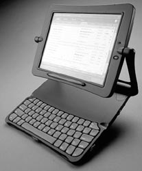 Frogdesign Outside: The design company has not started labeling its creations, choosing instead to let form be its signature.
 Brushing Up: Koziol brings anthropomorphic design to the most mundane and least appreciated of kitchen tools: the potscrubber.
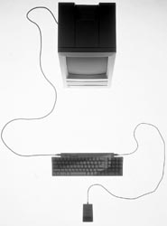 Computing Icon: The Mac SE is on permanent display in New York's Museum of Modern Art.
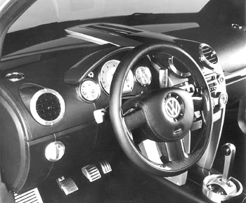
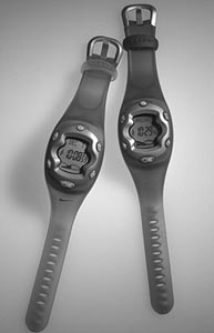 Surf's Up: Pentagram designed Nike's new surfing watch, which stores information